
Designing at scale
in e-commerce
Konga is not one product. It is a commerce ecosystem serving millions of Nigerians through a marketplace, a licensed payments company, logistics, health, and merchant platforms. For over four years I designed across that ecosystem: consumer journeys, seller tools, payment products, internal operations, and the search infrastructure underneath it all, including the search service that replaced a third party vendor and saves the business over $75k a year. The work taught me that scale is not about shipping more screens. It is about making an entire system feel like it was designed by one hand.
First, Konga
If you shop online in Nigeria, you know Konga. If you don't, here is the short version.
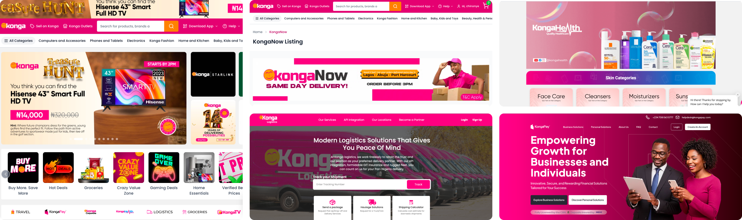
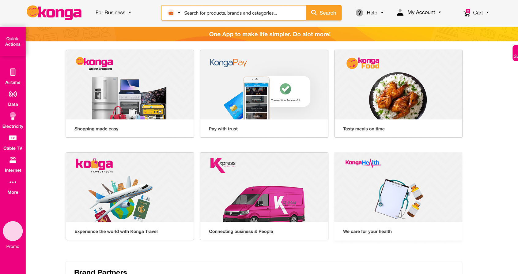
Konga is one of Nigeria's largest commerce companies. What began as an online marketplace grew into an ecosystem: Konga Online for shopping, KongaPay as a CBN licensed payments and mobile money operator, Konga Logistics for fulfilment, Konga Health, and a network of merchant and affiliate platforms that keep the whole engine running.
Each of these products serves a different audience with different needs. A shopper comparing phone prices. A seller managing three hundred SKUs. An operations analyst investigating a failed settlement. They all touch Konga, and they all deserve an experience that feels considered.
Designing across products, not inside one
I joined as a product designer in June 2021, but the job was never one product. I moved between consumer shopping journeys, merchant dashboards, payment experiences, internal tools, and platform infrastructure, often in the same sprint. From April 2022 the role became a two day a week retainer, running alongside my work at Afriex, which is why the two overlap on my resume.
That kind of work changes how you design. You rarely start from a blank file. You inherit legacy patterns, live traffic, technical constraints, and teams with their own release rhythms. Your job is to leave every product more coherent than you found it, without stopping the machine to do it.
Over four years I shipped work used by shoppers, sellers, affiliates, internal operations teams, and business stakeholders across the organisation.
Growth creates complexity. Complexity creates friction
Konga's products were built at different times, by different teams, for different goals. Each one worked. Together, they didn't always feel like one company. The symptoms showed up everywhere:
Fragmented patterns
The same action looked different across products. A merchant switching from Seller HQ to the Affiliate portal relearned basic interactions. Shoppers met one visual language on web and another on mobile.
Friction at the seams
Individual screens tested fine. The problems lived between them: checkout handing off to payment, search handing off to product pages, merchant tools handing off to inventory.
Cost hiding in infrastructure
Some of the biggest UX problems weren't visible in the UI at all. Search, the front door of any marketplace, ran on an expensive third party service the business didn't control.
The challenge was never "redesign this screen." It was: how do you introduce consistency across an evolving ecosystem without slowing the business down?
Four audiences. One ecosystem
Rather than walk through projects chronologically, here is the work grouped by who it served.
Faster paths from discovery to purchase
Millions of shopping sessions, and the highest intent moments carried the most friction. Working with product and the consumer engineering team, I redesigned the core shopping journey: a cleaner product details page that answers buying questions upfront, a checkout rebuilt to reduce steps and hesitation, and KongaNow for shoppers who need it today. The work had to fit how Nigerians actually shop: on mid range Android devices, on variable networks.
Checkout and KongaNow improvements linked to a 24% revenue increase, and a shopping journey that finally feels consistent from search to payment across every surface.
Fewer checkout steps meant collecting less up front and deferring some choices to after purchase, which is a real risk to order accuracy. I took it because the hesitation cost more than the corrections did, and designed the post purchase edits to be quick.
Tools merchants live inside
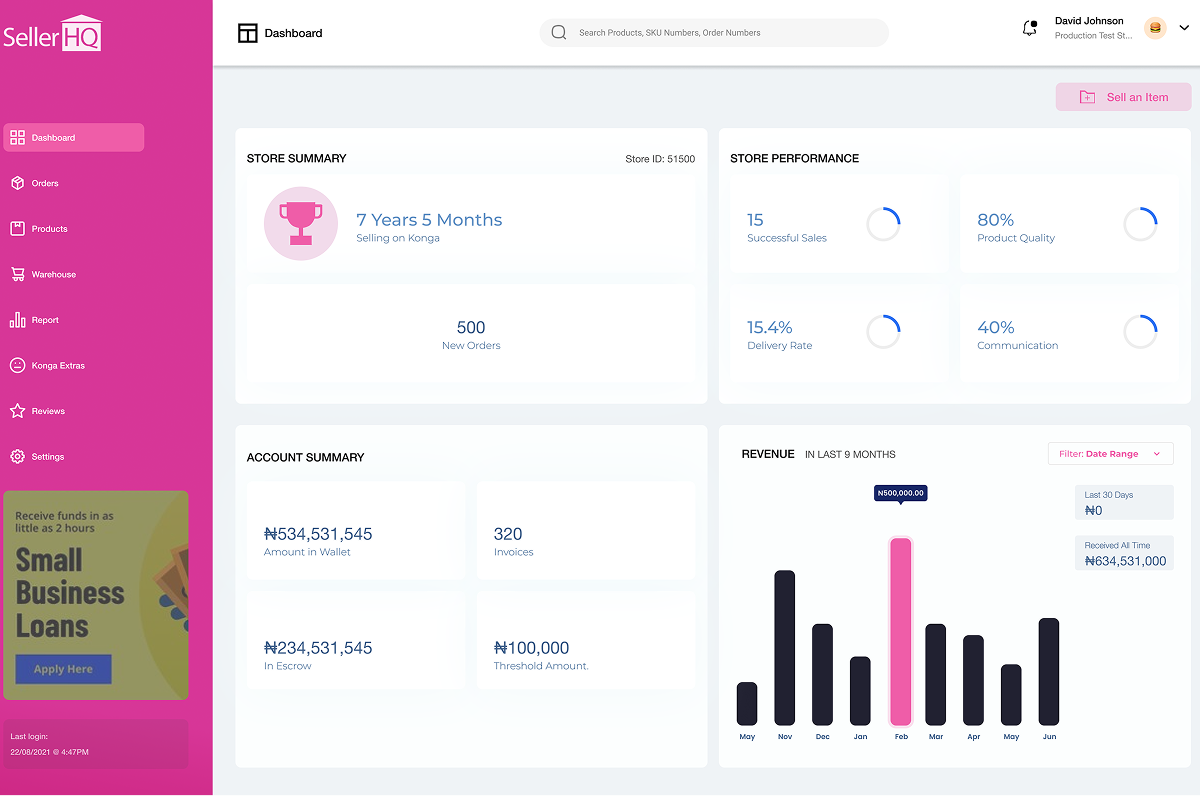
Merchants and affiliates spend hours a day inside these tools, so small inefficiencies compound into real operational cost, and dated interfaces erode the trust sellers place in the platform. Other designers owned adjacent seller surfaces, so consistency came from shared components and review rather than from one person deciding. I redesigned Seller HQ around merchants' actual daily workflows rather than the database structure underneath, and rebuilt the affiliate portal to make earnings, links, and performance legible at a glance, fully responsive for partners working from their phones.
Cleaner workflows, stronger information hierarchy, and merchant facing tools that finally match the quality of the consumer experience.
Designing around daily workflows instead of the database structure meant engineering had to build new views over existing data models. Slower to ship, but it is the difference between a tool merchants tolerate and one they actually use.
Payments that explain themselves
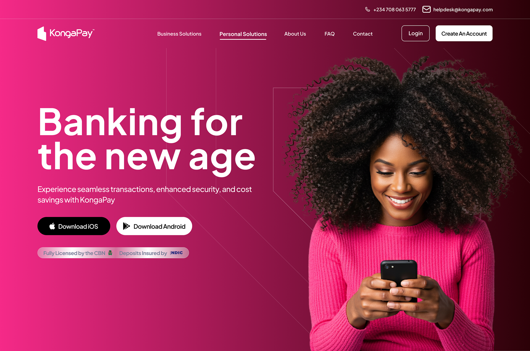
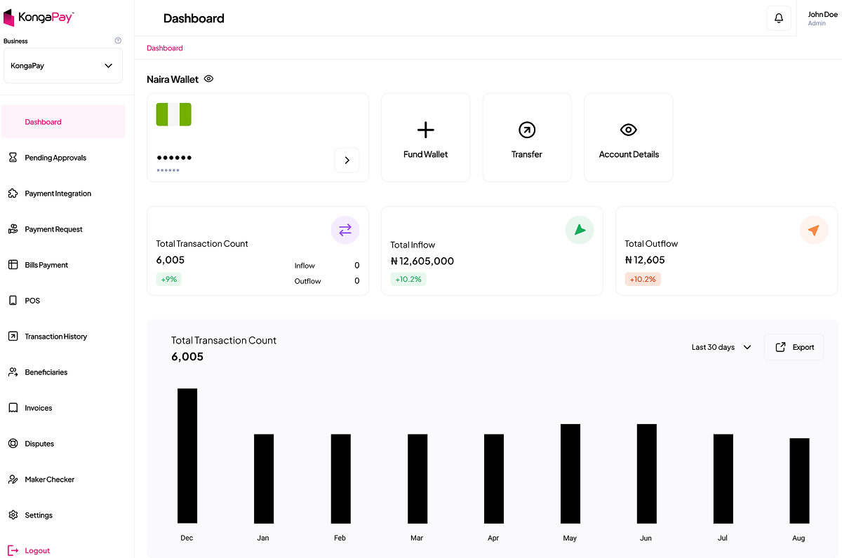
I redesigned the KongaPay website which needed a public face that communicated a licensed, trustworthy financial product, designed the merchant Inventory product from scratch across three platforms, partnered with another designer to rebuild the merchant admin dashboard for operational clarity, and led the user research and flow definition for the POS terminal experience, grounded in how Nigerian merchants actually take payments.
A coherent payment brand across surfaces, a 0→1 inventory product for merchants, faster internal operations, and research that grounded the POS roadmap in real merchant behaviour.
Shipping Inventory across web, iOS and Android at once stretched a small team. One platform first would have shipped faster but left merchants managing stock in two places. Coverage mattered more than speed here.
Replacing an expensive dependency
Search is the front door of a marketplace, and Konga's front door was rented. Discovery ran on a third party search provider whose costs scaled with the platform's growth, and whose capabilities the business didn't control. I was the sole designer on KSS, working with the search engineering team and merchandising team to design the product experience for KSS (Konga Search Service): the search experience itself, merchandising and relevance controls, and the internal tooling that lets the business tune discovery without an outside vendor.
Infrastructure is invisible when it works. This is the most invisible, and most valuable, design work I have done.
Building search in house meant accepting a period where relevance lagged the vendor while the tooling matured. I designed the merchandising and relevance controls first so the business could close that gap itself, rather than waiting on engineering for every tweak.
Inside a design team, not beside one
Konga is the counterweight to the rest of my portfolio. Everywhere else I have been the only designer. Here I was one of several, inside a multi-disciplinary team, working across products that other designers also owned. That changes the job: less deciding alone, more agreeing on what consistent means and then holding the line on it.
Shared surfaces, one visual language
Several of us worked across the same ecosystem, so a pattern invented in isolation became someone else's inconsistency. We reviewed each other's work, agreed on shared components, and split surfaces deliberately rather than by whoever picked up the ticket.
The merchant admin dashboard was a direct partnership with another designer, splitting the surface between us and reconciling it in review.
Legacy systems set the boundaries
Almost nothing here started from a blank file. Live traffic, existing data models and separate release rhythms shaped what was buildable, so feasibility conversations happened at wireframe stage rather than at handoff.
Seller HQ is the clearest case: designing around daily workflows instead of the database structure meant engineering had to build new views over existing models, and we agreed that cost up front.
Merchandising, ops and product in the room
Discovery, pricing and promotions are owned by people who are not designers. For KSS I designed the merchandising and relevance controls with the team who would use them daily, so the tooling matched how they actually think about ranking a catalogue.
Same for POS: the research was run with merchants and the payments team, not presented to them afterwards.
Four years, in numbers and in kind
Some of this work has a figure attached. Some of it changed how a team operates, which is harder to put in a cell but just as real. Both are here, labelled as what they are.
Saved every year after KSS replaced the third party search provider. The single most valuable thing I designed at Konga.
Revenue increase linked to the improved checkout and KongaNow experience.
Audiences designed for: shoppers, sellers and affiliates, payments users, and internal operations teams.
Merchant Inventory product designed from scratch across web, iOS and Android.
-
Merchant and affiliate tools stopped being the neglected side of the platform. Seller HQ and the affiliate portal were rebuilt around real daily workflows, fully responsive, so partners working from a phone were no longer second class users.
-
The business gained control of its own front door. With KSS merchandising and relevance tooling, discovery could be tuned in house instead of waiting on a vendor. The saving is the headline; the independence is the point.
-
Payments got a coherent public face. The KongaPay website and admin dashboard now communicate a licensed, trustworthy financial product, and POS research grounded that roadmap in how Nigerian merchants actually take payments.
-
One failed bet became a working principle. The Super App did not succeed, and the lesson it taught, that ecosystems are earned one trusted product at a time, shaped every consistency decision I made afterwards.
The Super App
My first real project as a product designer was also the most ambitious thing Konga attempted while I was there: a Super App unifying Konga Online, KongaPay, Konga Health, Konga Logistics, and KongaFood into a single experience.
Working alongside three other designers, I helped design the unified app. We were proud of it. And it didn't succeed.
KongaFood has since closed. The Super App is no longer in use. The honest diagnosis is that the strategy asked users to adopt a bundle before the individual products had each earned independent, habitual trust. The market wasn't ready, and the organisation couldn't resource five verticals evenly enough to make the bundle stronger than its parts.
I could leave this project off my portfolio. I'm keeping it, because it taught me something the successful projects couldn't: sequencing matters more than ambition. Ecosystems are earned one trusted product at a time. That lesson shaped how I approached every workstream that followed, and it's the reason I pushed for consistency across existing products rather than grand unification.
Four years. A different kind of lesson
Consistency is designed in, not enforced after
By the time inconsistency is visible, it is expensive. The cheapest moment to create coherence is before complexity arrives, in the patterns and components everyone builds from.
The best design work can be invisible
Nobody screenshots search infrastructure. KSS never had an audience beyond the teams that used it, and it created more value than anything else I shipped at Konga.
Sequencing beats ambition
The Super App taught me that the order in which you earn trust matters more than the size of your vision. I have carried that into every product decision since.